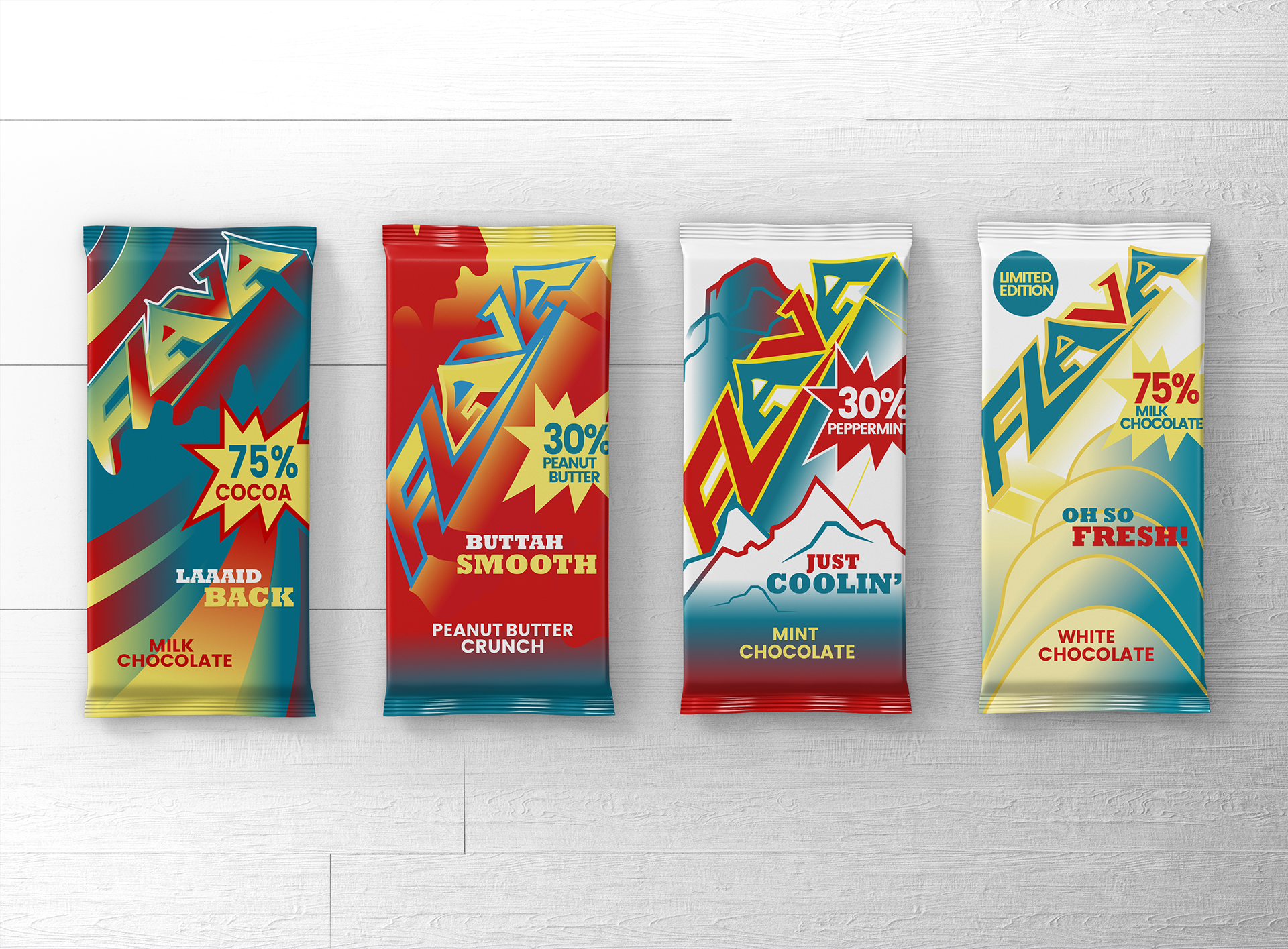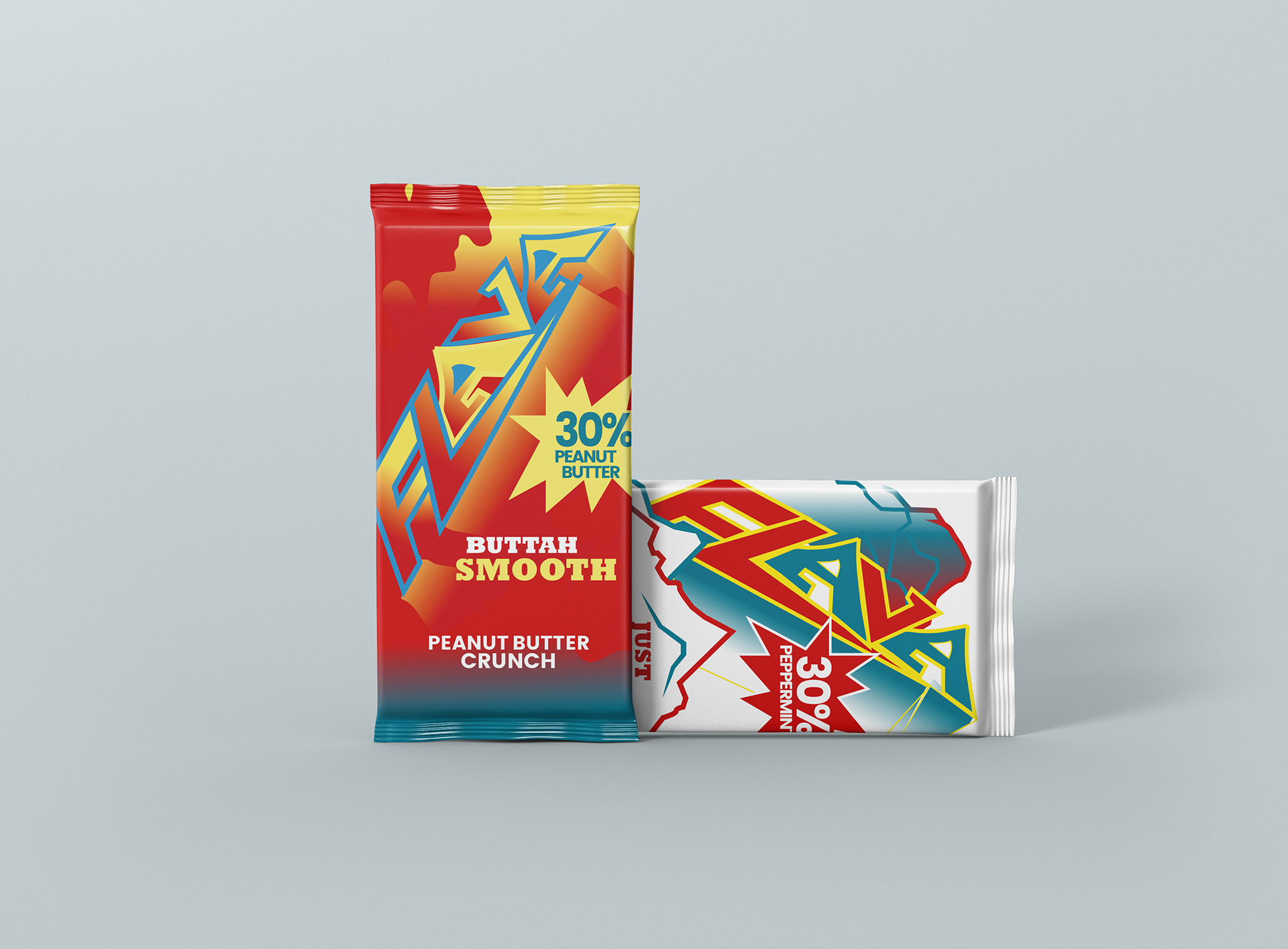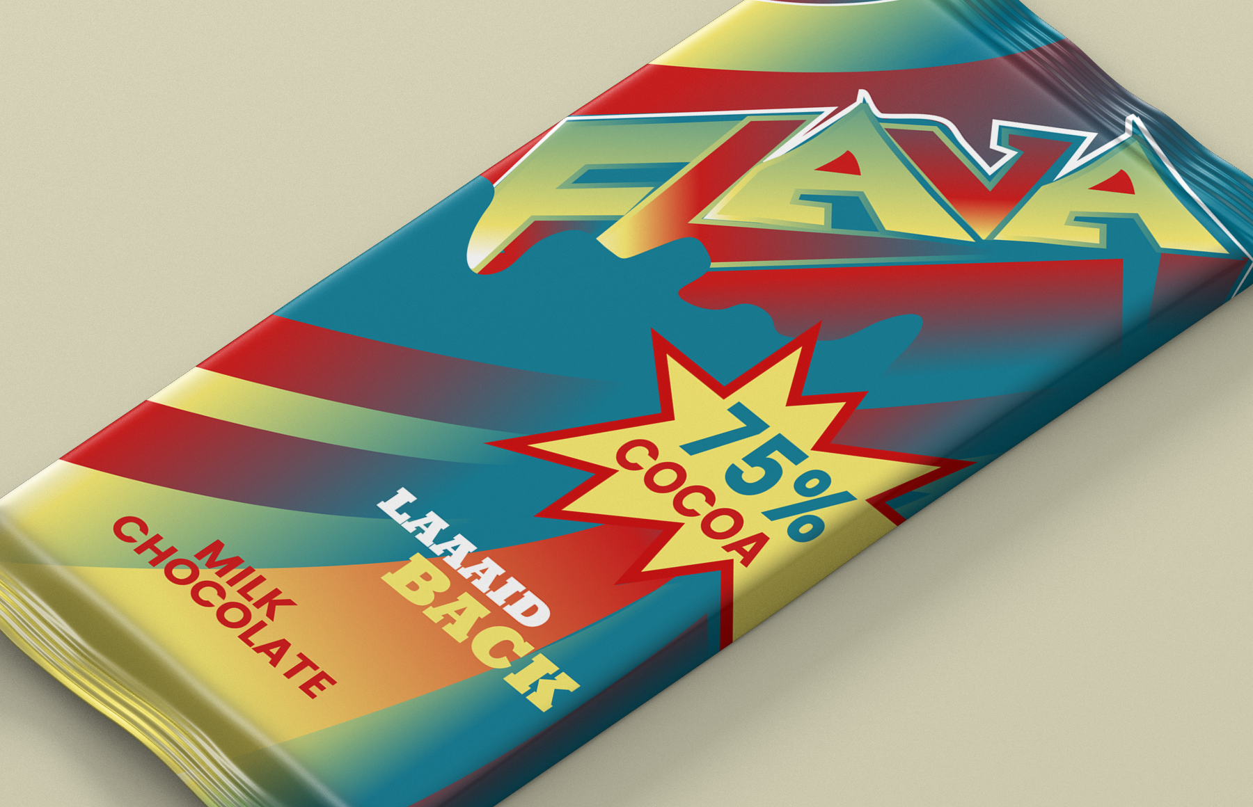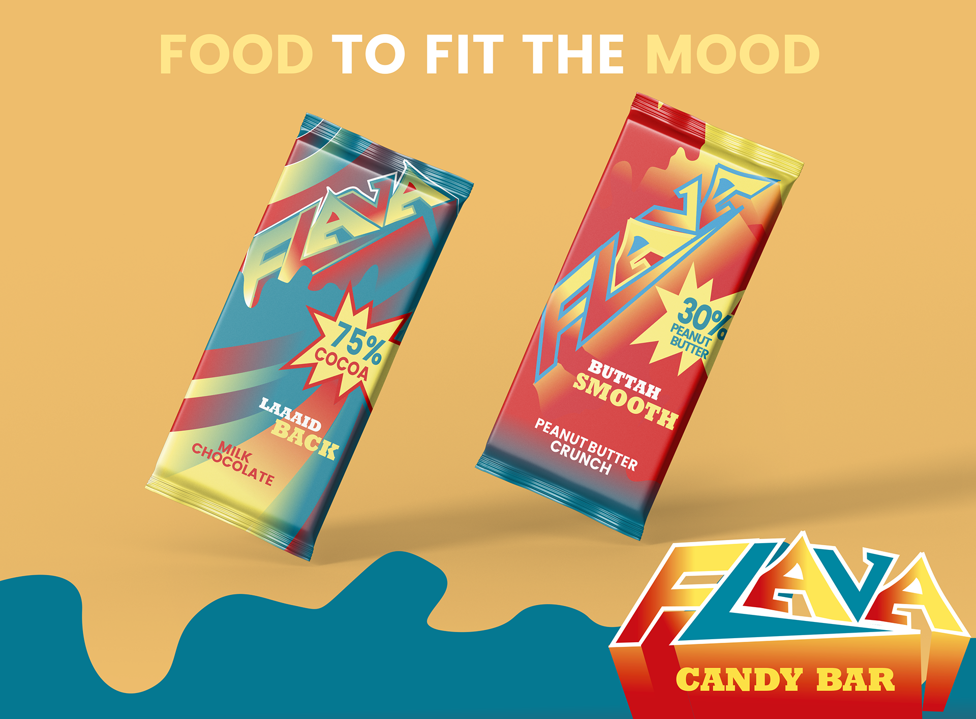
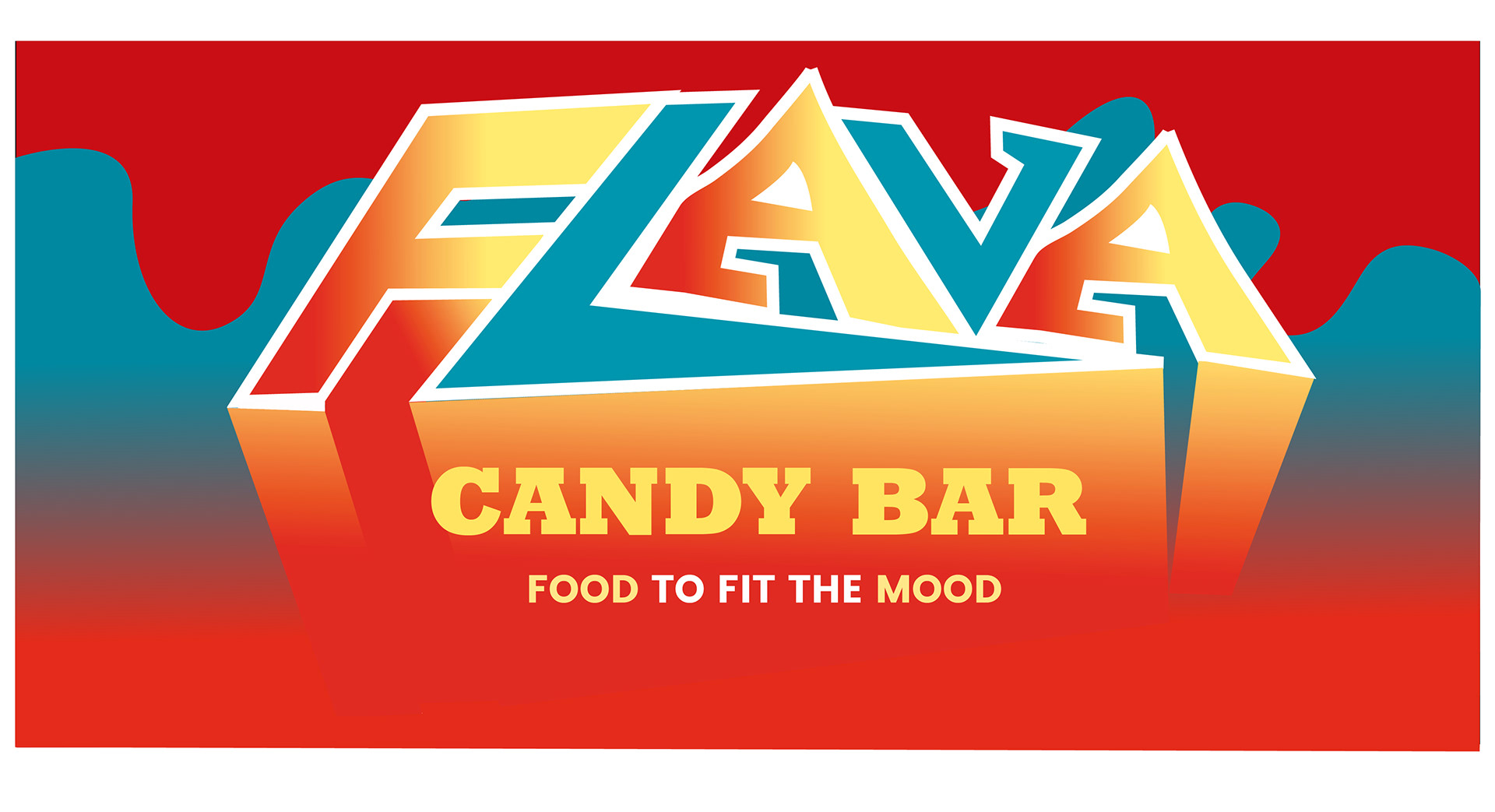
Series of typographic exploration and branding project.
I created a series of four typographic chocolate bars unified by one theme. The visuals for each bar reflect the taste of each chocolate, and represent four different moods/styles/personality traits, which are in correlation with the name of the manufacturer, "FLAVA".
The slogan is "FOOD TO FIT THE MOOD"
These typographic visuals displayed in the packaging are based on urban culture, slang, and lifestyle.
I fused hand drawn type with bold fonts and explored with placement of type, using bold colors to create interesting imagery.